US Mobile Power Wash
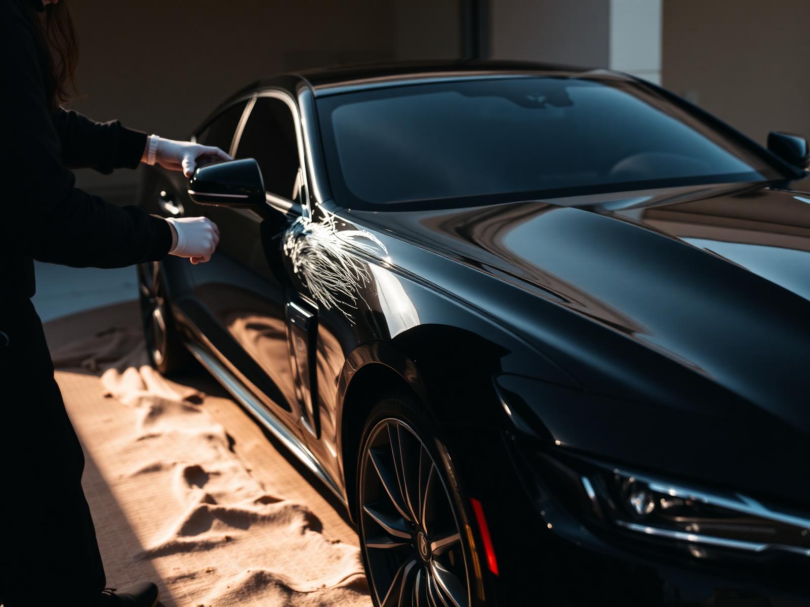
A dark, high-contrast pressure washing concept designed around one thing: visible before-and-after proof.
Project Overview
About the business.
US Mobile Power Wash is a service business whose entire value proposition is visual. The website exists to answer one question — will my property actually look better after this? — and to make the next step feel effortless once the answer is yes.
- Industry
- Exterior Cleaning
- Type
- Website Concept
- Role
- Design & Build
- Year
- 2025
The Opportunity
Where design could help.
Pressure washing companies typically rely on social posts and word-of-mouth, and their websites often feel like leftover business cards. The opportunity was to build a site that treats the transformation itself as the marketing, and to elevate a category most competitors are still under-investing in.
Design Goals
What this design is built to do.
Make the transformation impossible to miss
Before-and-after imagery had to become the centerpiece of the experience, not a secondary gallery buried below the fold.
Establish professional credibility instantly
A dark, considered visual system helps the business feel like a small crew rather than a one-time weekend operation.
Explain services without overwhelming
Homeowners rarely know what to call the work they need. The site had to translate industry terms into everyday outcomes.
Make requesting a quote feel effortless
The path to a quote had to be short, mobile-first, and free of any form field that isn't strictly necessary.
Strategy & Approach
The thinking behind it.
Every decision on the page is answering a specific business question. This is the reasoning that shaped the design.
Visual hierarchy
A near-black palette pushes the imagery forward and gives the transformations a stage. Typography is set at two clear weights — a large confident headline and a quiet supporting voice — so a visitor is never left wondering where to look next.
User flow
The page treats the visitor as pre-qualified: they already know their property needs cleaning. So the flow moves quickly from proof, to services translated in plain language, to a process section that removes uncertainty, and lands on a single quote action.
Conversion strategy
Instead of a hard sales push, the design uses repeated soft asks — a phone number in the top bar, a quote button in the hero, and a full contact section at the end — so a visitor can convert whenever they're ready without having to hunt for the option.
Trust building
The process section quietly resolves the biggest silent objection: 'what actually happens when they show up?' Making that transparent, before asking for a name and address, does more for trust than any badge or star rating.
Inside the Design
A closer look at each section.
Rather than a feature list, this is a section-by-section critique of the homepage — what each part is doing, why it sits where it does, and how it moves the visitor closer to the decision the business needs them to make.
Contrast doing the selling
The hero pairs a dark background with a bright, clean transformation image so the difference between neglected and restored is legible in a glance. It sets the tone that this is a serious operator, not a hobbyist.
The proof is the product
The gallery is placed directly under the hero rather than deeper in the page, because in this category the transformation isn't a supporting detail — it is the entire sales argument. Everything else on the page reinforces what the imagery has already promised.
Translated for the homeowner
Instead of listing techniques, services are framed by the surface being cleaned — driveway, siding, roof, deck. That mirrors how a homeowner actually describes the problem in their head and shortens the mental translation between 'I need this' and 'they do that'.
Removing the unknown
A short numbered process section shows what to expect from quote to completion. It doesn't sell — it reassures — and it appears right before the contact section, when hesitation would otherwise slow a visitor down.
One low-commitment ask
The contact section asks only for what's needed to prepare a quote. Reducing the form to essentials respects the visitor's time and consistently outperforms longer forms in service-industry conversion patterns.
Project Gallery
Designed to look right on every screen.
Business Impact
Why this design matters.
The finished concept turns a category most competitors still treat as an afterthought into a marketing asset, and gives the business a website that closes for it in the same way a strong portfolio would.
Clearer positioning
A confident visual identity separates the business from local competitors still relying on stock photos and generic templates.
Higher-intent leads
Framing services around outcomes attracts homeowners who already know the value of the work, not just the ones chasing the lowest price.
Fewer drop-offs on mobile
A short, mobile-first quote flow keeps momentum from the moment a visitor decides to reach out to the moment they hit submit.
Tools & Expertise
What went into this project.
Let's Talk
Interested in a similar website?
I'd love to help bring your business online with a website designed to build trust, strengthen your brand, and generate more leads.
Portfolio Concept
This project was independently created to demonstrate my design process, strategic thinking, and approach to solving real business challenges. It was not commissioned by the featured company.