SGLandscapes
An editorial landscaping concept designed to sit comfortably alongside the architecture and design brands its ideal client already follows.
Project Overview
About the business.
SGLandscapes designs and builds outdoor spaces for homeowners who care about how their property looks and feels. Their audience compares them against interior designers, architects, and studios — not other lawn services — so the website had to compete at that level, not below it.
- Industry
- Landscape Design
- Type
- Website Concept
- Role
- Design & Build
- Scope
- Independent Concept
The Opportunity
Where design could help.
Most landscaping websites lean on service checklists and stock imagery, which pushes the category into a price-driven conversation. The opportunity was to elevate a landscaping business into the same visual world as boutique architecture and interior brands, and let the quality of the work carry the pricing without having to defend it.
Design Goals
What this design is built to do.
Compete visually with design studios
The site had to feel closer to a portfolio-led architecture practice than a service company, so the audience naturally places the business in that tier.
Let completed work do the introduction
Homeowners want to see the outcome before they commit to a consultation, so imagery had to lead every section instead of supporting it.
Make the consultation feel like a considered next step
The call-to-action needed to feel more like beginning a conversation than filling out a lead form.
Read effortlessly on the device the client uses at night
Homeowners often research this kind of work in the evening on their phone, so the mobile experience had to feel as considered as the desktop one.
Strategy & Approach
The thinking behind it.
Every decision on the page is answering a specific business question. This is the reasoning that shaped the design.
Visual hierarchy
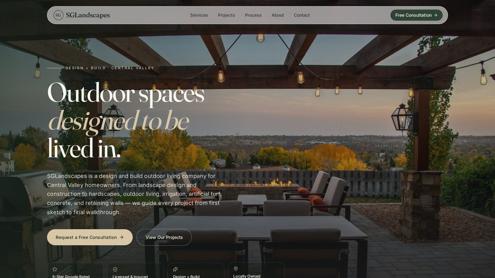
Warm typography sits above generous whitespace, so every project image is framed rather than crowded. The eye moves from headline, to image, to a small supporting caption — the same rhythm a design magazine uses to make photography feel intentional.
User flow
The homepage is structured as a slow reveal: a considered headline, a gallery, a short about section that quietly establishes taste, service framing that reads as capabilities rather than a menu, and finally a soft consultation ask. The pace itself is part of the pitch.
Conversion strategy
There's a single primary action — request a consultation — repeated in the right places rather than in every possible one. Restraint is intentional; a design-conscious client is more likely to convert on an invitation than on a chase.
Trust building
Trust is built through composition, not claims. Editorial layouts, considered spacing, and confident typography signal to the audience that this business understands taste — which is exactly what they're being hired for.
Inside the Design
A closer look at each section.
Rather than a feature list, this is a section-by-section critique of the homepage — what each part is doing, why it sits where it does, and how it moves the visitor closer to the decision the business needs them to make.
Editorial, not promotional
The hero opens with a quiet, confident line and a single hero image — no offers, no urgency, no stock overlay text. That restraint is the pitch: this is a business that lets its work speak first.
Placed early, framed like a portfolio
The gallery is positioned near the top because in this category, one strong image does more than ten paragraphs of copy. Each project is given room to breathe so the audience reads it as portfolio rather than proof.
A short, humanising anchor
The about section is intentionally brief. A short paragraph, a face, a point of view. It resolves the 'who am I hiring?' question before the visitor has to ask it, without slowing the flow of the page.
Capabilities, not a checklist
Services are framed as areas of expertise rather than a bulleted list. That reframing supports higher-value projects and moves the conversation away from square-footage pricing before it starts.
An invitation, not a form wall
The final section asks for the shortest useful conversation — a consultation, not a full brief. That lowers the psychological cost of reaching out and matches how design-led clients prefer to start relationships.
Project Gallery
Designed to look right on every screen.
Business Impact
Why this design matters.
The finished concept lets a local landscaping business present itself with the same confidence as the design studios its ideal client already follows, and quietly moves the conversation up-market.
Higher perceived value
A design-forward experience supports premium pricing without having to justify it in words.
Better-fit consultations
The tone of the site attracts clients who value taste and craftsmanship, which reduces friction on the eventual project.
Stronger brand recall
A distinctive visual system gives the business something referrals can point to, not just describe.
Tools & Expertise
What went into this project.
Let's Talk
Interested in a similar website?
I'd love to help bring your business online with a website designed to build trust, strengthen your brand, and generate more leads.
Portfolio Concept
This project was independently created to demonstrate my design process, strategic thinking, and approach to solving real business challenges. It was not commissioned by the featured company.