Protect & Shine Mobile Detail
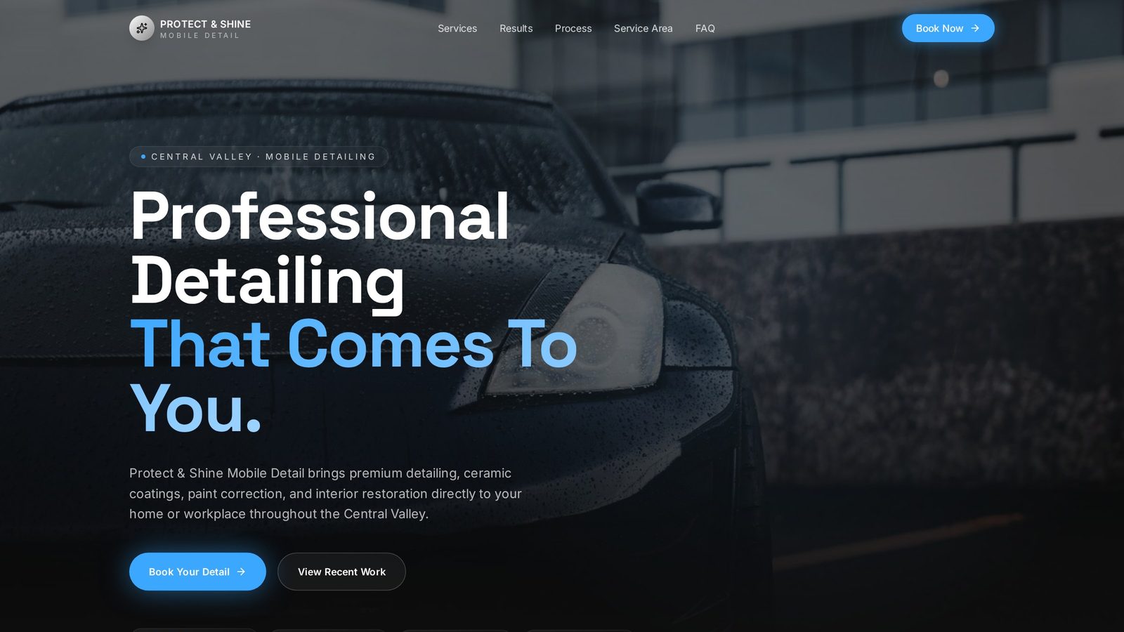
A cinematic mobile detailing concept designed to convert luxury car owners the moment they land on the page.
Project Overview
About the business.
Protect & Shine Mobile Detail is a premium mobile detailing service that comes to the customer. Their audience — owners of well-kept and often expensive vehicles — buys the result before they buy the service, so the website has to prove the quality of the work before it asks for a booking.
- Industry
- Auto Detailing
- Type
- Website Concept
- Role
- Design & Build
- Scope
- Independent Concept
The Opportunity
Where design could help.
Most detailing sites lead with pricing, service lists, or stock imagery — none of which answer the only question a luxury car owner is actually asking: can I trust this person around my car? The opportunity was to reframe the site around visible craftsmanship, letting the depth of the paint and the quality of the finish carry the sales argument long before any text has to.
Design Goals
What this design is built to do.
Signal quality in the first three seconds
The hero needed to feel closer to an automotive brand than a service page, so a customer instantly places the business in the premium tier.
Let results replace persuasion
Before-and-after imagery is positioned early and given room to breathe, so credibility is established through evidence rather than adjectives.
Remove friction from the booking path
A high-intent visitor should be able to reach the booking action from anywhere on the page without scrolling back to the top or reading a full brochure.
Build a brand that survives the drive-by test
Every surface — typography, spacing, imagery — had to hold up next to the customer's own vehicle, so the site itself feels like part of the product.
Strategy & Approach
The thinking behind it.
Every decision on the page is answering a specific business question. This is the reasoning that shaped the design.
Visual hierarchy
The page is built around one dominant visual moment at a time. Headlines are large and quiet, imagery is given full width, and secondary details are pulled back so nothing competes with the hero shot. The eye moves through the page in the same order a customer's confidence builds: reflection first, promise second, price last.
User flow
The homepage is intentionally short and vertical. A visitor lands on the transformation, scrolls through proof, sees the packages framed as tiers rather than lists, and arrives at a booking action while the imagery is still fresh. There are no side paths or nested menus — every click either books, calls, or scrolls.
Conversion strategy
Rather than one call-to-action, the design uses three moments of intent — after the transformation, after the packages, and after the testimonials. Each one is styled identically so the eye recognizes it as the same action, and each one is placed where a specific objection has just been answered.
Trust building
Trust is earned through restraint. Warm neutral tones, generous whitespace, and understated typography mirror the vocabulary of luxury brands the audience already trusts, and let the vehicles themselves — not marketing copy — carry the credibility.
Inside the Design
A closer look at each section.
Rather than a feature list, this is a section-by-section critique of the homepage — what each part is doing, why it sits where it does, and how it moves the visitor closer to the decision the business needs them to make.
A statement, not a pitch
The hero is deliberately unhurried. A single line of copy, a wide cinematic image, and a small primary action. It exists to make the visitor slow down — the opposite of a discount-driven service page — and to signal that this business belongs alongside the vehicles it services.
Proof positioned before pricing
Because customers buy detailing based on visual results, the transformation gallery is placed directly after the hero. Introducing pricing or packages before evidence would ask visitors to evaluate cost before they've decided whether the work is worth it, so the order was reversed.
Tiers framed as clarity, not upselling
Services are presented as three considered tiers rather than a long checklist. Framing them side-by-side lets a visitor self-select in seconds, and pushes the decision toward which package rather than whether to book at all.
Placed where doubt tends to appear
Testimonials sit immediately before the booking section — the exact moment a visitor is weighing whether to reach out. Third-party reassurance at that moment tends to move more people over the line than any additional feature or claim could.
A single, unambiguous action
The final section strips itself back to one action and one phone number. There is no form field asking visitors to qualify themselves, because a premium detailing customer expects the business to earn the details of the conversation, not extract them upfront.
Project Gallery
Designed to look right on every screen.
Business Impact
Why this design matters.
The finished concept positions Protect & Shine alongside the brands its customers already trust and reframes the site from a service brochure into a piece of marketing that closes for the business while it sleeps.
Stronger first impression
Visitors arrive on something that feels closer to a car brand than a service page, which raises perceived value before any conversation starts.
Higher-quality inquiries
By selling craftsmanship instead of discounts, the site attracts customers who care about the finish — not the cheapest quote.
Faster path to booking
Repeated, low-friction booking moments compress the distance between interest and action across every scroll depth.
Tools & Expertise
What went into this project.
Let's Talk
Interested in a similar website?
I'd love to help bring your business online with a website designed to build trust, strengthen your brand, and generate more leads.
Portfolio Concept
This project was independently created to demonstrate my design process, strategic thinking, and approach to solving real business challenges. It was not commissioned by the featured company.