Magallon's Roofing
A trust-first roofing concept designed around the exact objections that stop homeowners from requesting the first estimate.
Project Overview
About the business.
Magallon's Roofing serves homeowners making one of the largest single decisions they'll make about their home. That decision is driven almost entirely by trust, so the website had to be built around credibility rather than aesthetics or promotions.
- Industry
- Roofing
- Type
- Website Concept
- Role
- Design & Build
- Scope
- Independent Concept
The Opportunity
Where design could help.
Most local roofing sites default to loud calls-to-action, discount banners, and stock imagery. Those signals compete with dozens of other contractors and often erode the trust they're trying to build. The opportunity was to strip the noise away and let quiet confidence, credentials, and clear communication do the selling instead.
Design Goals
What this design is built to do.
Answer the trust question before anything else
The hero and the section directly beneath it had to resolve 'can I actually rely on these people?' before asking for any contact information.
Make the services legible in one scan
Homeowners are often reading between other tabs, so the service structure had to be understandable at a glance without reading every word.
Turn projects into proof
Completed work needed to be shown as evidence of craftsmanship, not as a decorative gallery.
Make the estimate feel like the low-risk step
The estimate request had to feel like an easy, no-pressure conversation — because that's the psychological barrier the entire category is losing at.
Strategy & Approach
The thinking behind it.
Every decision on the page is answering a specific business question. This is the reasoning that shaped the design.
Visual hierarchy
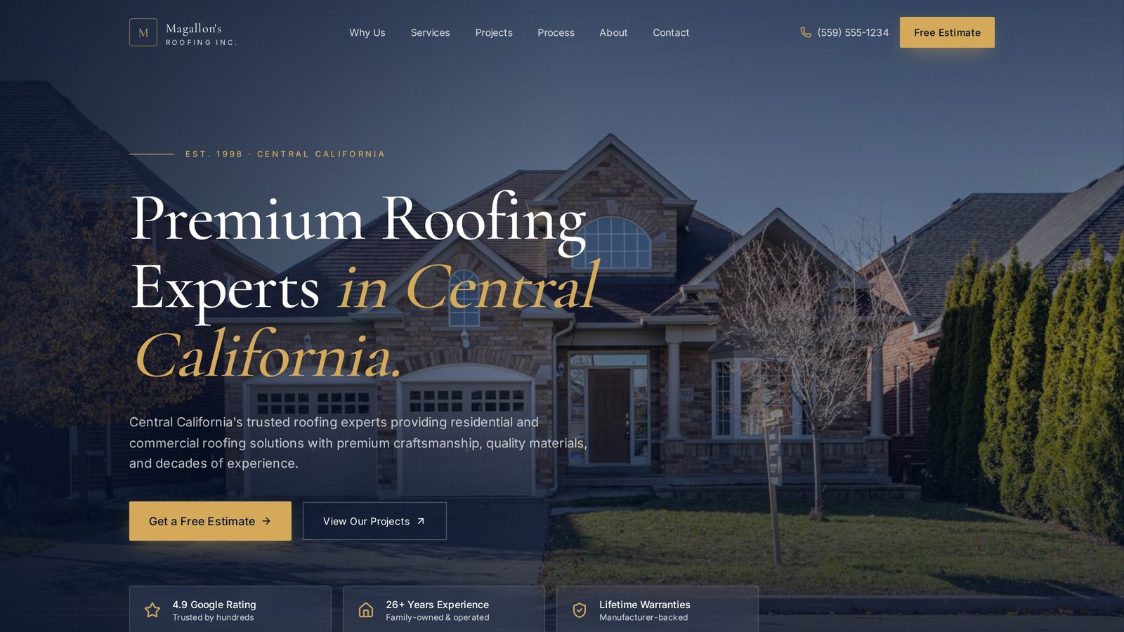
A calm, restrained palette and a strong single headline replace the usual carousel of promotions. The eye lands on the primary claim, then on one clear action, then on the credibility markers that back it up — in that exact order.
User flow
The flow is deliberately linear: promise, credentials, services, work, testimonials, estimate. Each section removes an objection so that by the time a visitor reaches the estimate request, most of the reasons they might hesitate have already been quietly resolved.
Conversion strategy
Instead of asking for the sale early, the design earns it. The estimate CTA is repeated in low-pressure moments — after credibility, after work, after testimonials — so the visitor converts on their own timeline rather than on a pop-up's.
Trust building
Trust is not a section on this site — it's the design system. Restrained typography, disciplined spacing, and honest photography all signal a business that takes its own presentation as seriously as its craftsmanship.
Inside the Design
A closer look at each section.
Rather than a feature list, this is a section-by-section critique of the homepage — what each part is doing, why it sits where it does, and how it moves the visitor closer to the decision the business needs them to make.
Confidence without volume
The hero uses one clear headline and one primary action, with no overlaid urgency. In a category dominated by shouted promotions, quiet confidence reads as competence — and competence is exactly what a homeowner is buying.
Placed directly after the promise
The section immediately beneath the hero exists to substantiate the claim above it. Credentials and guarantees appear here — not buried in a footer — so the sales argument and the proof arrive together instead of in separate rooms.
Structured for scanners, not readers
Services are laid out as short, scannable cards. A homeowner researching between other tabs can identify the relevant service in seconds, which is closer to how this decision actually gets made than long paragraph blocks.
Evidence, not decoration
Completed projects are presented with just enough context to read as proof — where, what, and roughly when. That framing turns a gallery from a nice-to-have into an argument for craftsmanship.
Positioned right before the estimate
Testimonials appear immediately before the estimate section to reinforce confidence at the exact moment visitors are deciding whether to reach out. Placing them earlier would leak the effect; placing them later would waste it.
A short, respectful ask
The estimate form asks only what's needed to schedule a visit. Every additional field would be an additional reason to close the tab, so the form is stripped to essentials and framed as the start of a conversation.
Project Gallery
Designed to look right on every screen.
Business Impact
Why this design matters.
The finished concept shows how a roofing company can win on trust rather than volume, and gives the business a website that competes on the exact axis its ideal customer actually cares about.
Stronger credibility
A restrained, well-considered site reads as competence in a category full of visual noise.
Clearer communication
Homeowners understand what's offered without having to read every word, which reduces confusion-driven drop-off.
Easier path to estimate
A short, respectful form and an earned-not-demanded CTA lower the psychological cost of reaching out.
Tools & Expertise
What went into this project.
Let's Talk
Interested in a similar website?
I'd love to help bring your business online with a website designed to build trust, strengthen your brand, and generate more leads.
Portfolio Concept
This project was independently created to demonstrate my design process, strategic thinking, and approach to solving real business challenges. It was not commissioned by the featured company.