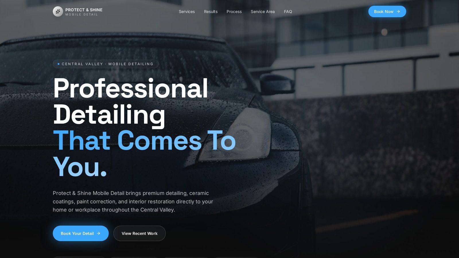
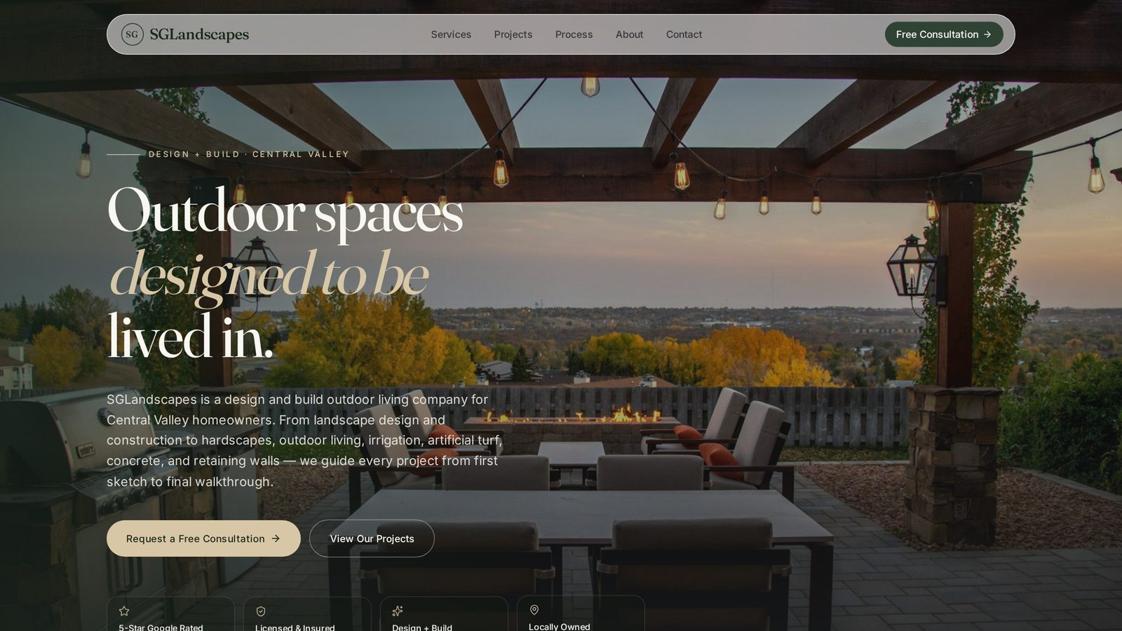
Morrow Coffee Co.
A warm editorial concept for a neighborhood specialty coffee bar, designed around how people actually decide where to spend their morning.
Project Overview
About the business.
Morrow Coffee Co. is a fictional neighborhood specialty coffee bar created as an independent design concept. The brief I set myself was hospitality-specific: a café website is rarely read, it's scanned — usually on a phone, usually by someone deciding in the next two minutes whether this is the place they walk to. The design had to make that decision easy and make the room feel worth walking to.
- Industry
- Coffee Shop / Hospitality
- Type
- Website Concept
- Role
- Design & Build
- Scope
- Independent Concept
The Opportunity
Where design could help.
Independent cafés tend to end up with one of two websites: a social feed with no useful information, or a template with a PDF menu and a map pin. Both miss the same thing — atmosphere is the product, and the menu is the deciding factor. The opportunity was to design a site that carries the warmth of the room and still answers the practical questions (what's on, where is it, can I order ahead) without making anyone hunt.
Design Goals
What this design is built to do.
Make the room legible before the menu
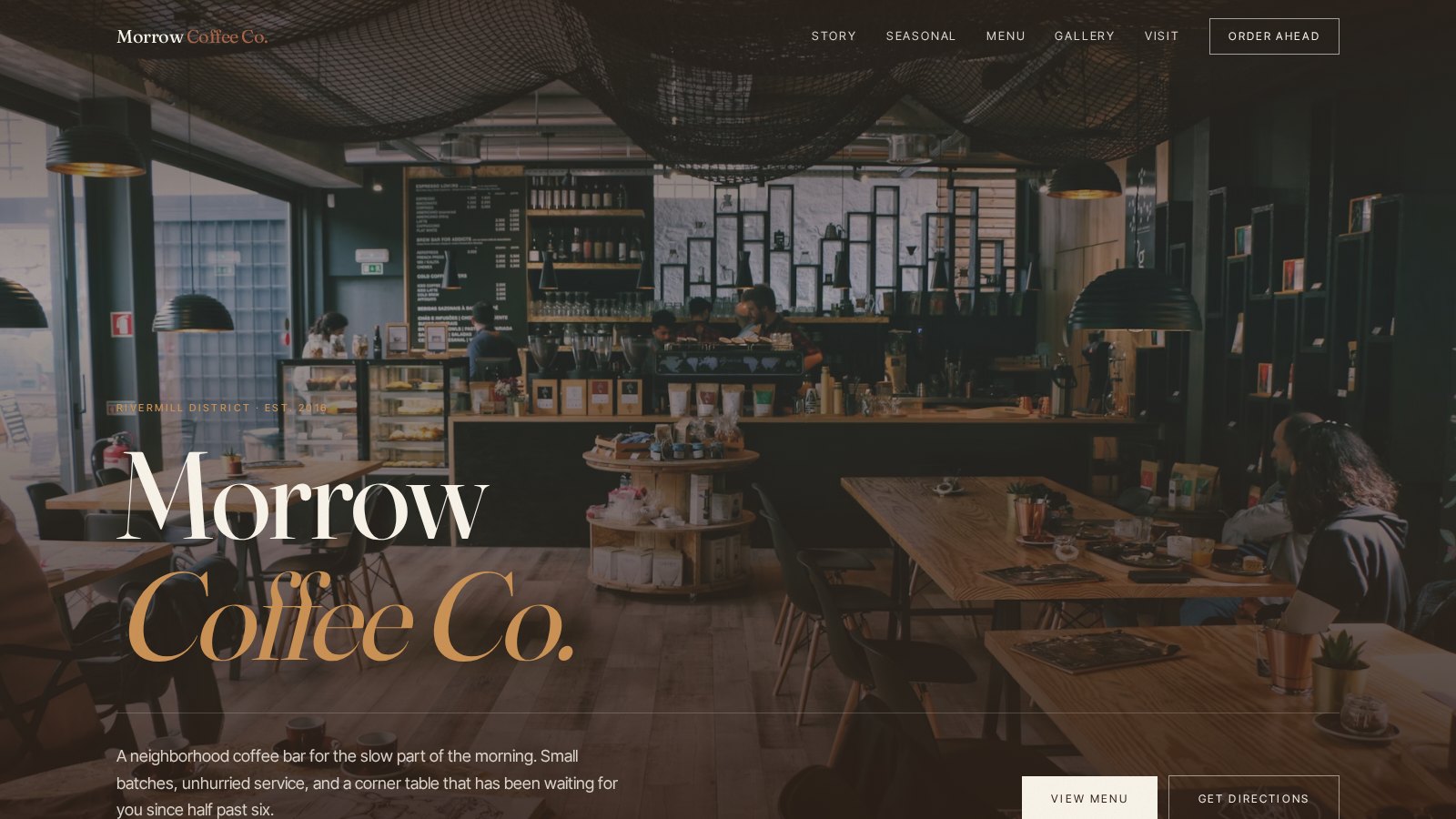
Someone choosing a café is choosing a place to sit. Photography and typography lead so the atmosphere is understood in the first scroll, before any list of drinks appears.
Design the menu for a phone, not a printout
The menu had to be readable and browsable on a small screen — grouped, typeset, and scannable — rather than an embedded document that forces pinch-and-zoom.
Keep visiting one tap away
Hours, location and directions are the highest-intent information on a café site, so they stay reachable from anywhere rather than living only in the footer.
Give order-ahead a clear, unpushy home
Order-ahead is a convenience path, not the headline. It's placed as a persistent secondary action so the regulars can skip the queue without the concept turning into an ordering app.
Strategy & Approach
The thinking behind it.
Every decision on the page is answering a specific business question. This is the reasoning that shaped the design.
Visual hierarchy
The palette stays warm and low-contrast — dark roasted neutrals with a soft amber accent — so photography holds the page and typography never competes with it. A high-contrast serif carries the brand voice while a quiet sans handles all practical information, which keeps the emotional and functional layers visually separate.
User flow
The page follows the order of a real decision: what is this place, what's pouring right now, what's on the menu, what does it feel like inside, and how do I get there. Seasonal offerings sit high because that's the detail that turns a maybe into a walk, and the visit section closes the page where intent is highest.
Menu discovery
Rather than a single long list, the menu is grouped the way a barista would explain it — espresso, brew, seasonal, food — with prices set quietly so the section reads as an invitation rather than a price sheet. The intent is to let someone find their usual drink in a couple of seconds.
Story and atmosphere
The story section is short and specific rather than a founder essay. Paired with a gallery of the room, it's designed to answer 'would I want to sit here?' — the question most café sites never actually address — without slowing the path to the practical sections.
Inside the Design
A closer look at each section.
Rather than a feature list, this is a section-by-section critique of the homepage — what each part is doing, why it sits where it does, and how it moves the visitor closer to the decision the business needs them to make.
The room as the headline
The hero is a full-bleed photograph of the space with a single warm line of copy over it. No offer, no urgency. For a hospitality concept the photograph is the value proposition, so the type is kept restrained enough to let the room read first.
What's pouring right now
A seasonal section sits near the top because it's the only genuinely time-sensitive thing a café has to say. Giving it its own moment — instead of burying it inside the menu — is intended to make a returning visitor feel like there's a reason to come back this week.
Typeset, not embedded
The menu is real typography with clear grouping and generous line spacing, so it stays legible on a phone in one hand. Prices are set in a lighter weight beside each item so the eye reads the drink first and the cost second, which keeps the section feeling hospitable rather than transactional.
Short, specific, human
A few sentences and a photograph do the work of an about page. Specificity — small batches, unhurried service, a particular corner table — signals a point of view, which is what separates an independent café from a chain in a visitor's mind.
Atmosphere as evidence
The gallery is composed like a photo essay rather than a grid dump: varied crops, breathing room, and no captions competing for attention. It exists to extend the feeling of the hero rather than to document every corner of the shop.
Everything needed to actually show up
The visit section brings hours, address, and directions together in one block, with the directions action styled as a primary step. Splitting these across the page is a common café-site mistake — collapsing them into one place is designed to remove the last bit of friction between interest and a visit.
Project Gallery
Designed to look right on every screen.
Business Impact
Why this design matters.
As an independent concept, Morrow Coffee Co. demonstrates how a small hospitality business can present itself with the warmth and editorial confidence of a brand people want to be seen in — while keeping the practical paths a café actually lives on. No real client engagement or measured results are represented here.
Atmosphere communicated up front
Leading with photography and warm typography is intended to help a visitor feel the room before they evaluate the menu.
Lower-friction menu browsing
A typeset, grouped menu is designed to be readable on a phone without zooming, which is how most café menus are actually consulted.
A clearer path to visiting
Consolidated hours, location, directions, and a steady order-ahead action are intended to shorten the distance between curiosity and walking in.
Tools & Expertise
What went into this project.
Let's Talk
Interested in a similar website?
I'd love to help bring your business online with a website designed to build trust, strengthen your brand, and generate more leads.
Portfolio Concept
This project was independently created to demonstrate my design process, strategic thinking, and approach to solving real business challenges. It was not commissioned by the featured company.