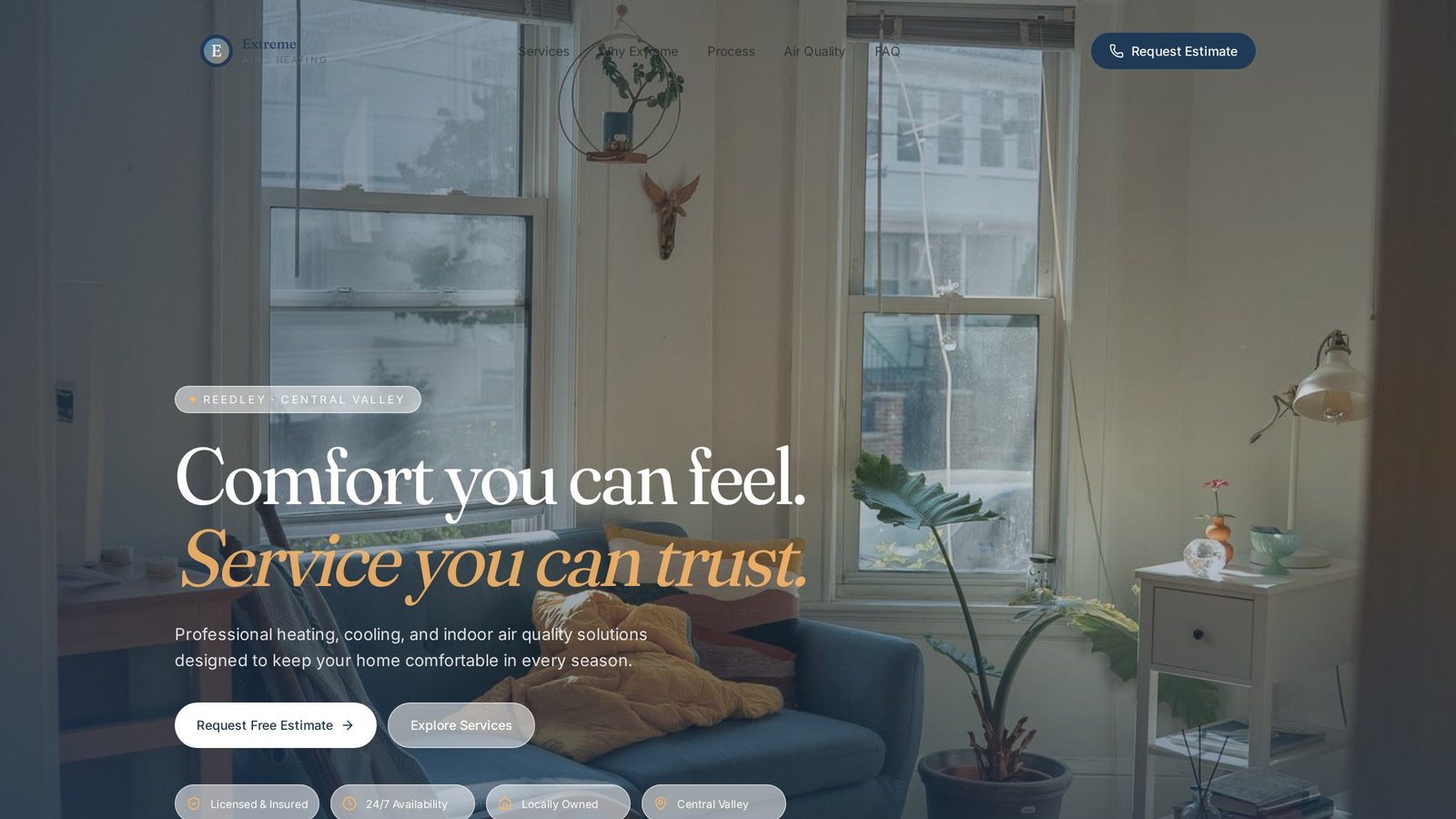
Extreme Air Conditioning & Heating
A mobile-first HVAC concept built around one truth: most visitors are already uncomfortable and want the shortest possible path to help.
Project Overview
About the business.
Extreme Air Conditioning & Heating serves homeowners who almost always arrive on the site under real pressure — a system down, a hot afternoon, a cold morning. That context shapes every design decision on the page.
- Industry
- HVAC
- Type
- Website Concept
- Role
- Design & Build
- Scope
- Independent Concept
The Opportunity
Where design could help.
Most HVAC sites treat the homepage like a brochure and bury the phone number behind menus, forms, and hero carousels. The opportunity was to design for the actual state a customer is in when they land: uncomfortable, distracted, on their phone, and looking for the fastest possible resolution.
Design Goals
What this design is built to do.
Make contact the fastest visible action
A visitor should be able to call, text, or request service within seconds of landing, regardless of scroll position.
Communicate emergency availability up front
The single most important question — 'can you come out today?' — had to be answered before the visitor has to ask.
Present services without slowing the visitor down
Service details had to be legible at a glance for the majority of visitors who don't have time to read.
Feel professional enough to earn the call
Speed alone isn't enough — the site still had to look like a business a homeowner would let into their home.
Strategy & Approach
The thinking behind it.
Every decision on the page is answering a specific business question. This is the reasoning that shaped the design.
Visual hierarchy
The hero foregrounds availability and a single high-visibility contact action. Everything else on the page — services, credentials, testimonials — is intentionally quieter, because in this category confidence is measured in how quickly you can get help, not in how much copy you can read.
User flow
The site is built as a short vertical funnel with contact actions repeated at consistent intervals. A visitor never has to scroll to find help; the phone number rides along in the header on mobile and reappears at every logical decision point.
Conversion strategy
The design assumes intent. Instead of nurturing the visitor through a long story, it removes obstacles between arrival and action. Testimonials and credentials exist not to persuade but to reassure someone who's already close to reaching out.
Trust building
Trust is built through tone and clarity — a calm interface, direct language, and no exaggerated claims. In a stressed moment, a calm site feels more trustworthy than an aggressive one, and calmer trust is what earns the call.
Inside the Design
A closer look at each section.
Rather than a feature list, this is a section-by-section critique of the homepage — what each part is doing, why it sits where it does, and how it moves the visitor closer to the decision the business needs them to make.
Availability as the headline
The hero leads with the answer to the visitor's real question — same-day service — instead of a brand statement. That single reframing does more for conversion than any additional feature or promotion could.
Always within thumb reach
The phone number sits in the header on mobile so it's reachable from any scroll position. Removing the friction of scrolling back up when someone finally decides to call is a small change that quietly compounds across every visitor.
Scannable, not exhaustive
Services are compressed into short cards a visitor can absorb in a glance. Detail is available for the small percentage who want it, but the design doesn't demand reading as a prerequisite to contacting the business.
Reassurance before the ask
Testimonials sit right before the final contact section. In a category where a stranger is entering the customer's home, third-party reassurance at that exact point makes the difference between a considered call and a closed tab.
One low-commitment path
The final section offers a single primary action and a single alternative. No captchas, no five-field form, no chatbot. Every reduction in friction here is designed to make contacting the business as easy as possible.
Project Gallery
Designed to look right on every screen.
Business Impact
Why this design matters.
The finished concept gives an HVAC business a website that meets the customer where they actually are — stressed, mobile, and one tap away from calling a competitor — and quietly removes every reason not to call.
Faster time-to-contact
Repeated, visible contact actions collapse the distance between arrival and the first call.
Better first impressions on mobile
A mobile-first layout communicates competence on the device most emergency visitors are using.
Higher conversion on stressed traffic
Calm design and clear availability are intended to reassure customers already under pressure, rather than pressure them further.
Tools & Expertise
What went into this project.
Let's Talk
Interested in a similar website?
I'd love to help bring your business online with a website designed to build trust, strengthen your brand, and generate more leads.
Portfolio Concept
This project was independently created to demonstrate my design process, strategic thinking, and approach to solving real business challenges. It was not commissioned by the featured company.